Graphic Design
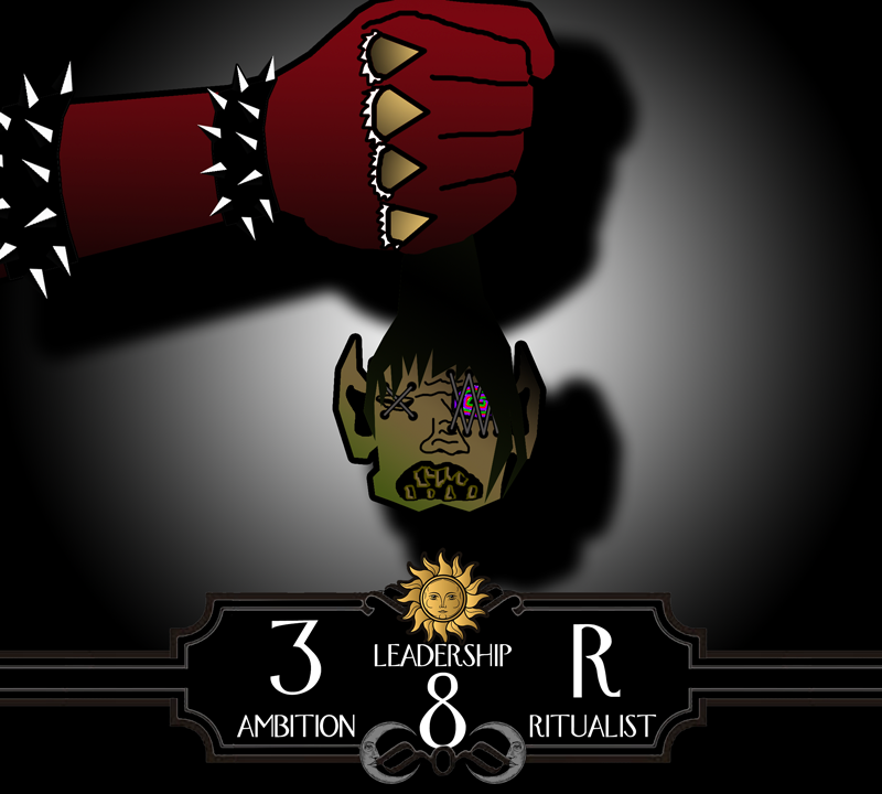
Cultist Card Game (Untitled; Future Kickstarter)
My second Kickstarter! In the near future, I’m aiming to launch this card game. The premise is you are a Cult Leader who thrives on using every power and technique at your disposal to not only recruit the nearby Townsfolk, but to crush your opponents along the way. First to perform their Ascension Ritual wins!


Lighthouse: Beacon in the Night (Upcoming Kickstarter)


Dead Town (Band)

The request: “I want a different colour scheme than our logo. I want it to stand out/contrast against the last design. The EP has no title; just gotta be a different colour scheme so it pops out in the album lineup.”
Dead Town EP (No. 1)
This “untitled” EP Cover Art I made for Dead Town re-releases three great tracks to whet your Alt Rock appetite. Since their logo was dark in colour, I went for an old comic book theme - almost always bright and lively! The “fake” barcode on the cover, if scanned, contains a secret message that modern mobile barcode scanning apps will reveal…

The request: “I want a graphic done up with a beat-up sparrow turning into a phoenix while the silhouette of the city behind glows with fire… in a sailor Jerry tattoo art style. Heavy outlining with a brown/grey/red/orange/black sort of colour palette.”
Dead Town Logo
(Alternative Rock Band)
This is a logo I made for a band called “Dead Town” from Winnipeg, Manitoba, Canada. They’re just starting out, so if you like Alternative Rock, check them out and share them around!

No request, except to make a band logo. Inspired by Dan Brown’s novel “Angels and Demons” for the Alternative Rock band “Dead Town”
Dead Town Ambigram
Although this went unused in the final draft, I made this ambigram for Dead Town to see if I could make the logo appear one way right-side-up, and look different upside-down, yet still allow the viewer to read their band name easily.
Mistero
(Tech Repair, Publishing, Web Design)

Mistero! The company that started it all and published my first book - Rise of the Morningstar! Growing up, I was always impressed by company logos that took subtle elements about their name and what their brand was all about, and combined it all into one symbol of utmost simplicity. So with Mistero, I approached it the same way. At first glance, it is simply a man with a hat. But looking at it more closely, the name “Mistero” can be broken down into “Mister” and “O” - or in another form: Mr. O. The crown of the man’s hat is the “M” in “Mr.”, while the brim employs the lower-case “r”. His face is the “O”, completing “Mr. O” or “Mistero”. The owner of the company has the first initial “J” in his name, which has been subtly included in the face as the man’s smirk. Now placed at the center of a gear, it implies that once this gear, Mistero, is placed as a mere cog in the machine, suddenly everything is united and connected and works as planned.
National Microbiology Lab
(Government of Canada)

The request: “We want to do a ‘scavenger hunt’ of sorts for kids who come out to celebrate our building’s 20th anniversary. We have stations setup all around - but we need a booklet to hand out to everyone who wants to participate. That way, they all are carrying one thing, instead of a variety of papers. Can you help?”
20th Anniversary for Federal Government building
On display above is my first draft proposed to the amazing staff who reached out for a 20th Anniversary pamphlet. It was a 20+ page “passport”, where the ID page was about the building’s inception and statistics, while the rest of the document perfectly resembled a real Canadian passport that could be stamped as they traveled “around the world” to each activity station. While this look was ultimately not the final design (solely on the ground of avoiding any potential accusations of counterfeiting), I was still pretty proud of the cover, and all 20+ pages created from scratch!

The request: “Can you take this staff photo and make it look really good, so that we can ‘psych-out’ our international competition?”
Mustache Competition
This is the “spicing up” of a corporate Mustache-growing competition in Canada. Originally, the photo was taken in a hallway, with lots of “noise” many staff members were “not ready” for the photo, but with a bit of editing - and a splash of badass imagery - this was the result!